The Meaning of Color
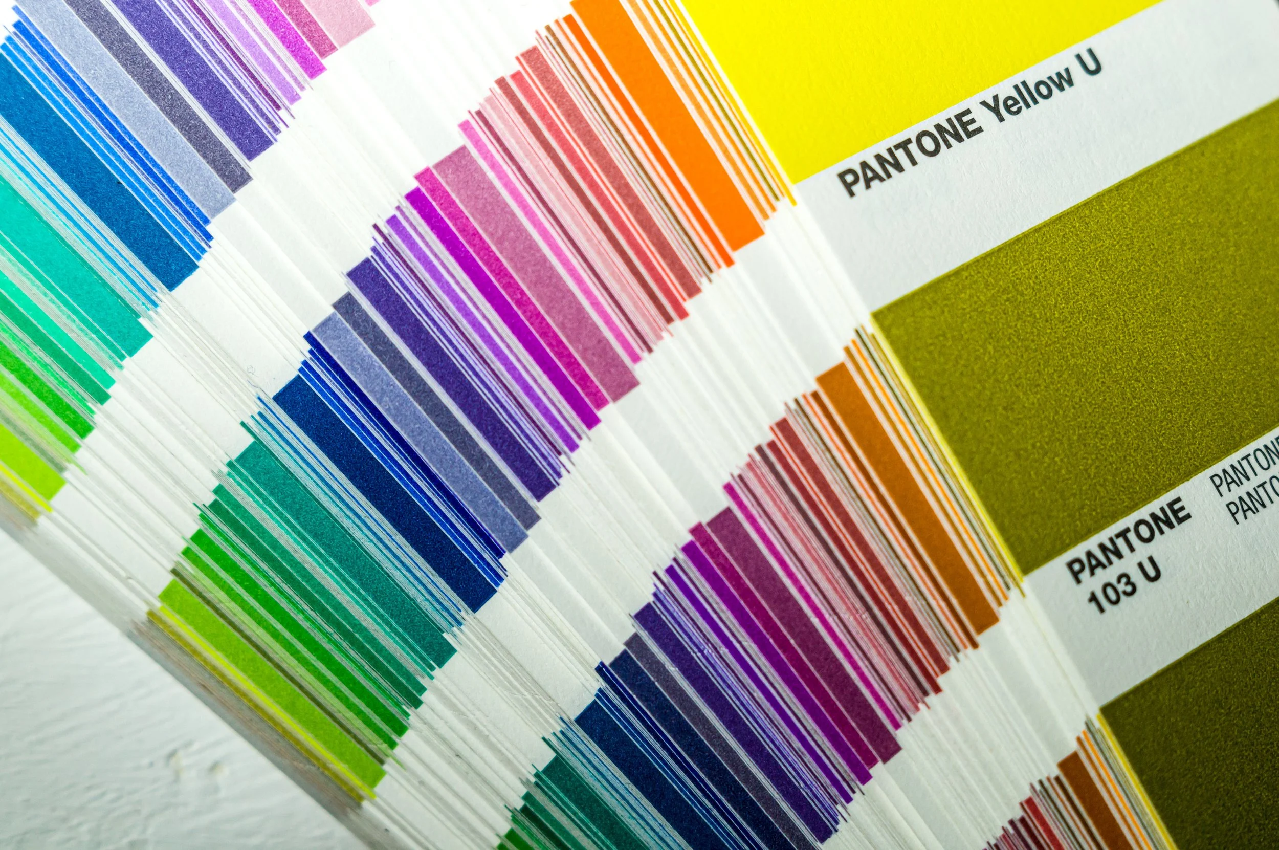
Did you know that COLOR is a critical element in your design and it can trigger different types of emotions? Color theory is the artistic and scientific study of how colors interact. It explores how we perceive and process colors both physically and emotionally. Here’s why it’s crucial in branding:
First Impressions: Colors evoke immediate emotional responses. They set the tone for how people perceive your brand. For example, red can create a feeling of urgency and high energy, while blue might convey trust and stability.
Consistency: Brands use consistent colors to build recognition. Think of iconic brands like Coca-Cola with its red logo or Facebook with its blue color scheme. Consistency helps customers remember and identify your brand.
Emotional Impact: Colors influence moods and feelings. Yellow makes people feel bright and vibrant, while green is associated with nature and calmness. Brands strategically choose colors to align with their desired emotional response.
Differentiation: Unique color choices help your brand stand out. Consider Tiffany & Co. and its signature Tiffany Blue—instantly recognizable and associated with luxury.
Below is a list of commonly used colors along with the emotions they are typically associated with:
Red: Danger, excitement, fire, passion, fight or flight.
Purple: Wealth, royalty, sophistication, intelligence.
Blue: Serenity, truth, dignity, constancy, reliability, power.
Black: Sophistication, elegance, power, rebellion.
White: Purity, cleanliness, luminosity.
Yellow: Warmth, happiness, vibrancy, joy.
Green: Nature, freshness, health.
A LOT of thought goes into color selection, especially with so many shades of colors to choose from. Once you’ve invested the time and consideration into picking specific colors to represent your brand, how do you ensure print accuracy and usage consistency? We’ve got you covered: Color Accuracy in Proofing

